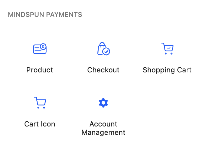
All Mindspun Payments features use Gutenberg blocks. Everything is a block – or, more accurately, a set of blocks – that allows every aspect to be configured, resulting in a pixel-perfect, fully responsive design. All features can be added and styled without writing a single line of code.
Native Gutenberg blocks mean you can use any page builder you want – or none at all.
The places on your site where you’ll need to add ‘Mindspun Payments’ are almost entirely within the body content of your site. You don’t need a block-based theme or full-site editing to use these blocks – although you certainly can.
Block usage and general features
Mindspun Payments adds a handful of top-level blocks to the Gutenberg editor.

Each block has inner blocks that can be used to control the functionality or style the layout in any way you choose.
General block options for Mindspun Payments
The composite blocks are generally more configurable than standard core blocks, so the options may not be initially obvious.
For instance, the Product block has not only the button and production information to be displayed but also the modal that is shown to the user – if desired – before taking them to the checkout page. The checkout page has the checkout screen itself, the cart empty message, and the screen is shown to the user after they complete a purchase.
The lightbulb icon in the Gutenberg header shows these different block views. This icon is in the header whenever a block with different views is selected.

Clicking on the lightbulb icon shows a menu of available views and allows you to switch between them. See the documentation for the individual blocks on what views each of them has.
This option is not found in native Gutenberg so it takes a moment to get familiar with it.
 Mailing Address